Cross Border Kitchens
Cross Border Kitchens
Cross Border Kitchens
Cross Border Kitchens
A cloud kitchen company based out of Delhi that houses 6 brands and provides home catering services
A cloud kitchen company based out of Delhi that houses 6 brands and provides home catering services
A cloud kitchen company based out of Delhi that houses 6 brands and provides home catering services
A cloud kitchen company based out of Delhi that houses 6 brands and provides home catering services
00
00

00

00

Problem
Cross Border Kitchens houses 6 brands under it who have their own brand identity. However the parent company lacked a brand identity which can house brands from different cuisines. Cross border kitchens wanted to differentiate itself from the usual funky and loud branding of cloud kitchens. Another problem to solve was that the branding had to be smooth enough to flow across offline and online channels. A twist was the brand didn't wanted to let go of it's old logo so the new branding had to go with that.
Solution
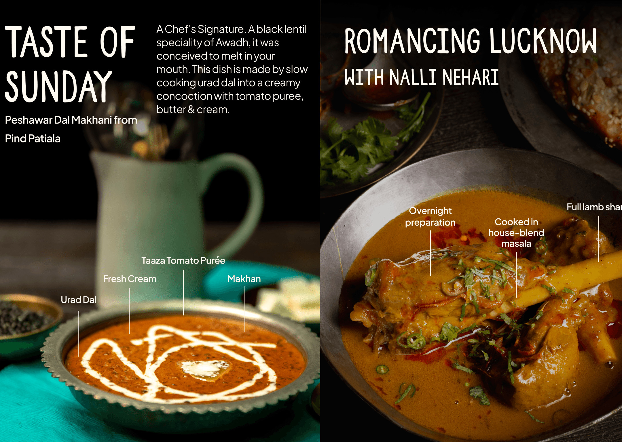
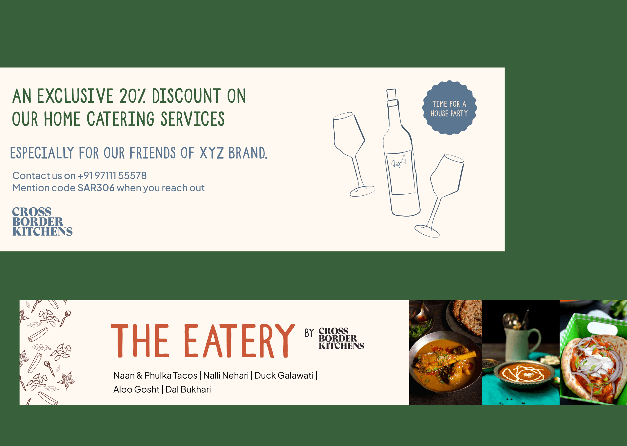
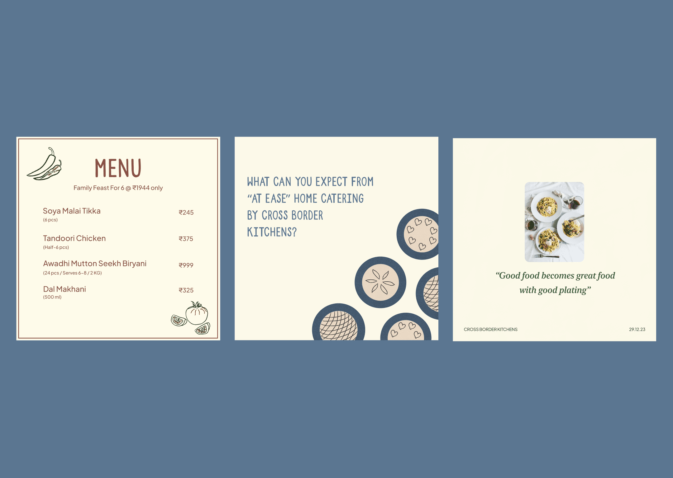
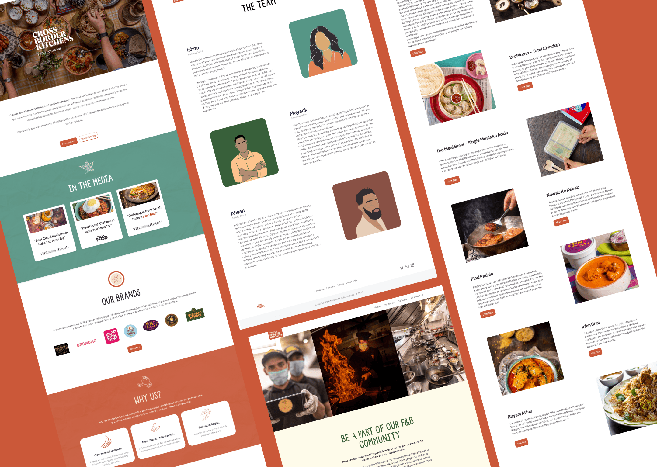
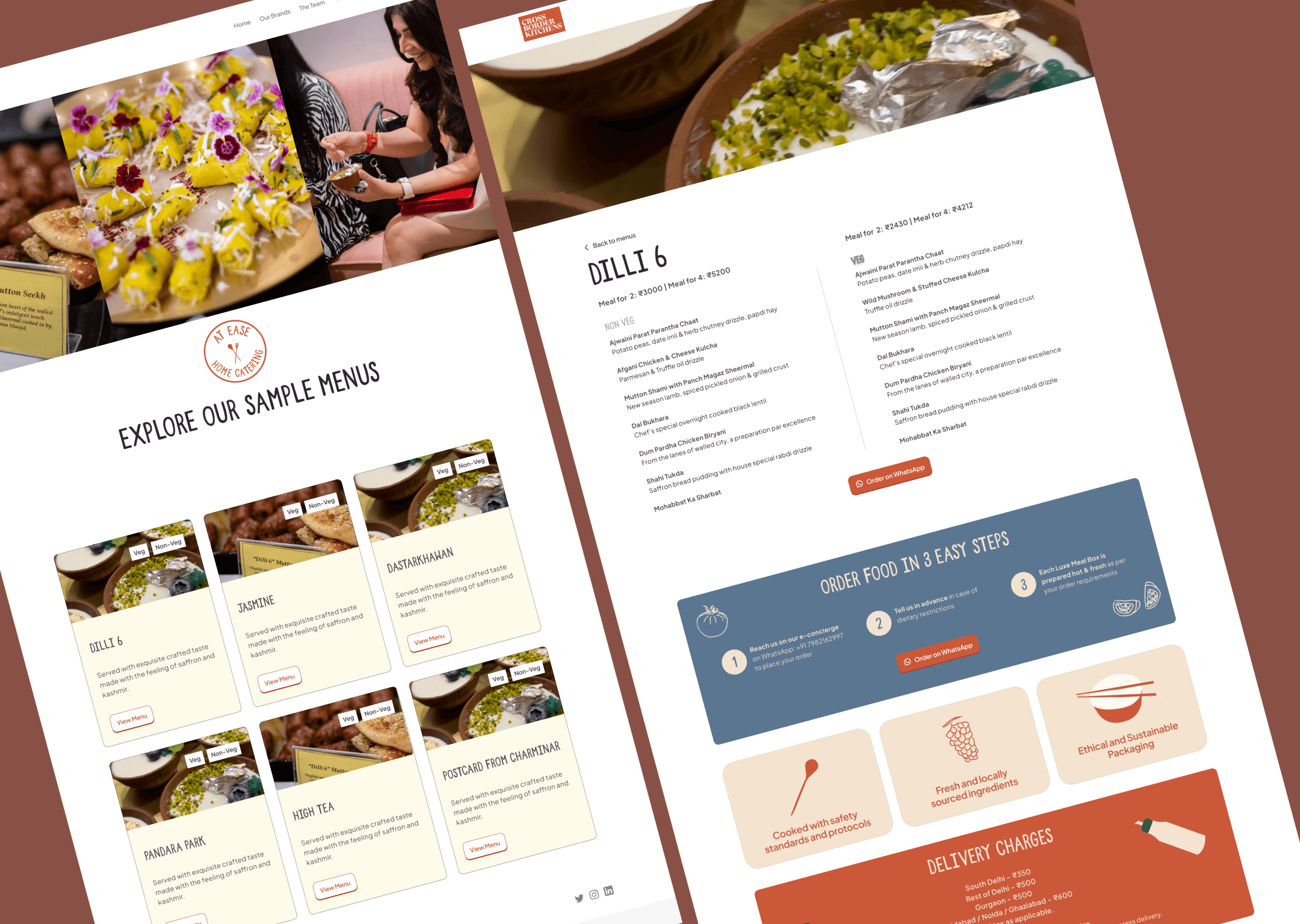
Cross Border Kitchens wanted to be all about good food and experiences. I differentiated the branding by giving a fun look to the overall branding. The project included curating the brand identity from scratch, curating a logo for the home catering unit and deisgning the website. It included a branding system that catered to both offline and online channels as the brand was very much active on both.
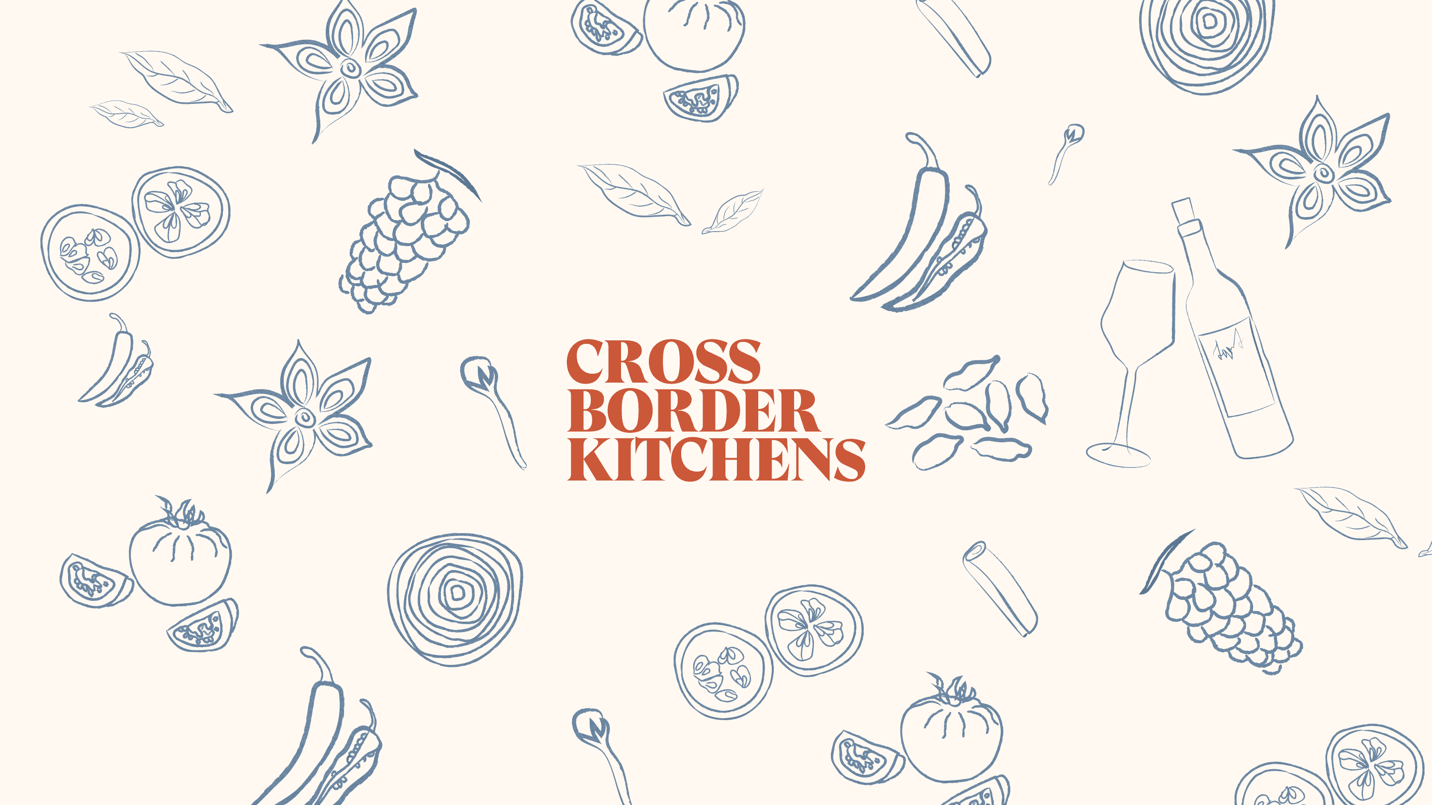
The visual elements of the brand had to be strong enough to narrate the story that Cross Border Kitchens had to tell it's audience. Therefore the colour pallet and the illustrations were very deeply researched to give the final output very different from what's available in the market.
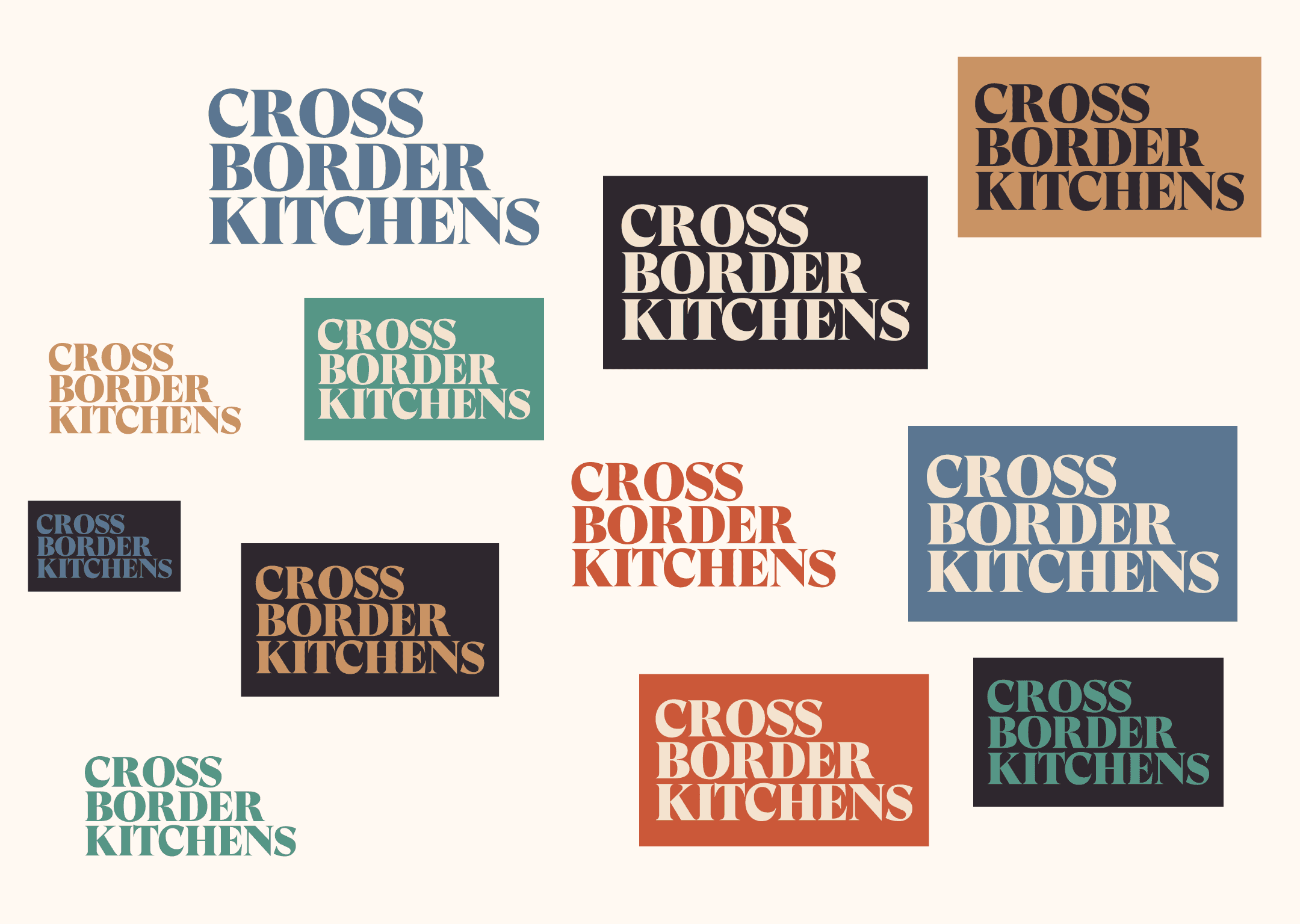
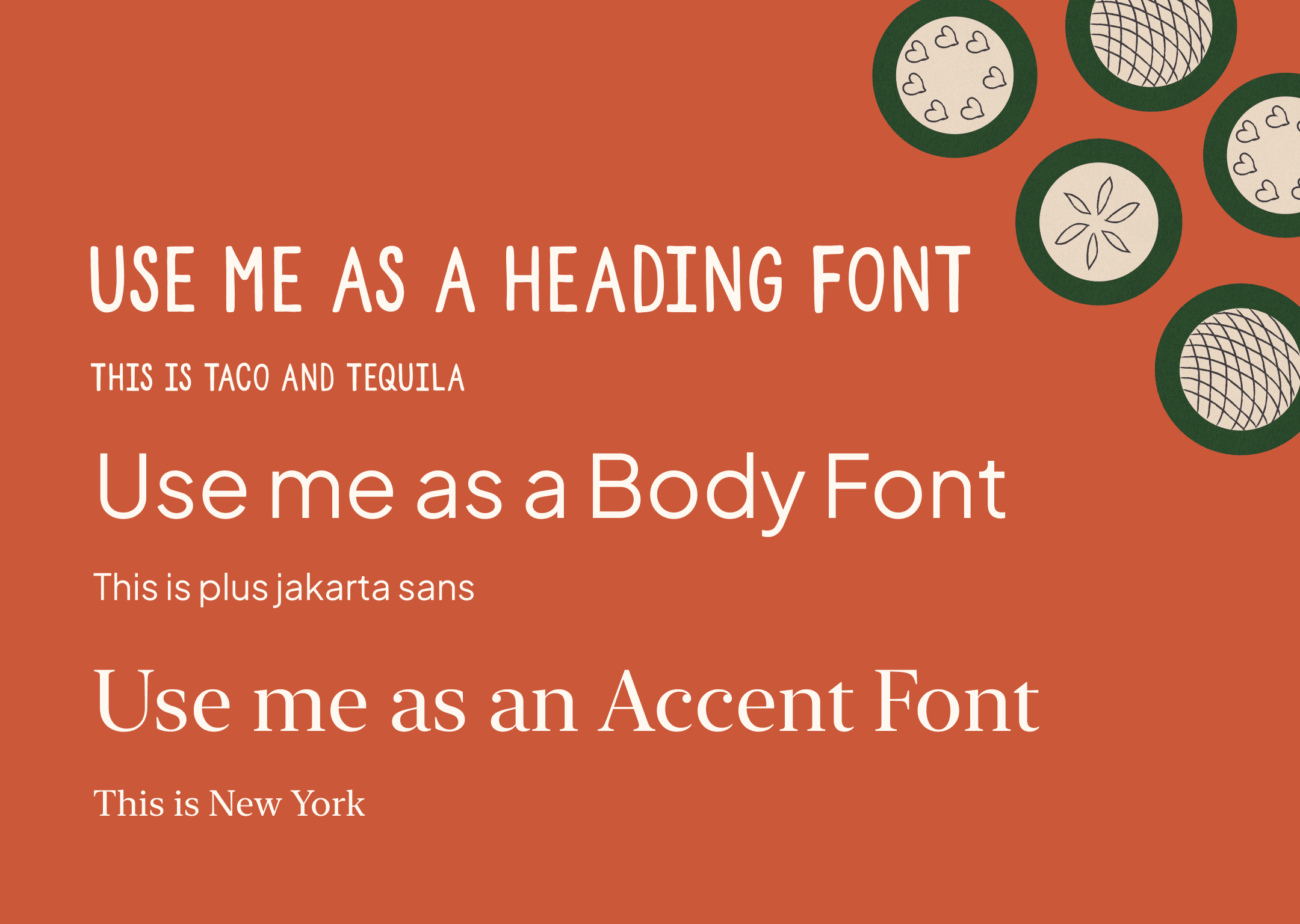
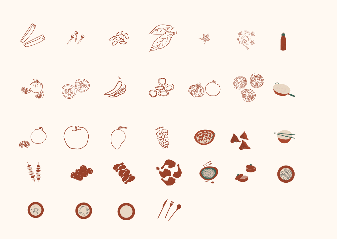
The project was done with Two Things a studio based out of Delhi. The creative direction and overall of the voice of the brand was designed with strong collaboration with the team at Two Things. We went with a muted colour pallet that could accompany various branding assets of the other in-house brands. The amazing illustrations were made by Bavatharani who beautifully added a narrative to the overall brand story. The illustrations also have paper effect almost to feel like they have been cut out to make a scrap book just like how we add our memories and experiences to a scrapbook the website tried to encapsulates the same.
year
2023
timeframe
1 month
tools
Figma and Illustrator
category
Branding and Web Design
The visual elements of the brand had to be strong enough to narrate the story that Cross Border Kitchens had to tell it's audience. Therefore the colour pallet and the illustrations were very deeply researched to give the final output very different from what's available in the market.

The project was done with Two Things a studio based out of Delhi. The creative direction and overall of the voice of the brand was designed with strong collaboration with the team at Two Things. We went with a muted colour pallet that could accompany various branding assets of the other in-house brands. The amazing illustrations were made by Bavatharani who beautifully added a narrative to the overall brand story. The illustrations also have paper effect almost to feel like they have been cut out to make a scrap book just like how we add our memories and experiences to a scrapbook the website tried to encapsulates the same.
year
2023
timeframe
1 month
tools
Figma and Illustrator
category
Branding and Web Design
The visual elements of the brand had to be strong enough to narrate the story that Cross Border Kitchens had to tell it's audience. Therefore the colour pallet and the illustrations were very deeply researched to give the final output very different from what's available in the market.

The project was done with Two Things a studio based out of Delhi. The creative direction and overall of the voice of the brand was designed with strong collaboration with the team at Two Things. We went with a muted colour pallet that could accompany various branding assets of the other in-house brands. The amazing illustrations were made by Bavatharani who beautifully added a narrative to the overall brand story. The illustrations also have paper effect almost to feel like they have been cut out to make a scrap book just like how we add our memories and experiences to a scrapbook the website tried to encapsulates the same.
year
2023
timeframe
1 month
tools
Figma and Illustrator
category
Branding and Web Design
The visual elements of the brand had to be strong enough to narrate the story that Cross Border Kitchens had to tell it's audience. Therefore the colour pallet and the illustrations were very deeply researched to give the final output very different from what's available in the market.

The project was done with Two Things a studio based out of Delhi. The creative direction and overall of the voice of the brand was designed with strong collaboration with the team at Two Things. We went with a muted colour pallet that could accompany various branding assets of the other in-house brands. The amazing illustrations were made by Bavatharani who beautifully added a narrative to the overall brand story. The illustrations also have paper effect almost to feel like they have been cut out to make a scrap book just like how we add our memories and experiences to a scrapbook the website tried to encapsulates the same.
year
2023
timeframe
1 month
tools
Figma and Illustrator
category
Branding and Web Design



01
02

02

02

02
03

03

03

03
04

04

04

04
05

05

05

05
06

06

06

06
07

07

07

07
08

08

08

08
09

09

09

09
.say hello
I'm open for freelance projects.
Feel free to email me to see how can we collaborate!
.say hello
I'm open for freelance projects.
Feel free to email me to see how can we collaborate!
.say hello
I'm open for freelance projects.
Feel free to email me to see how can we collaborate!
say hello

