Tatva
Tatva
Tatva
Tatva
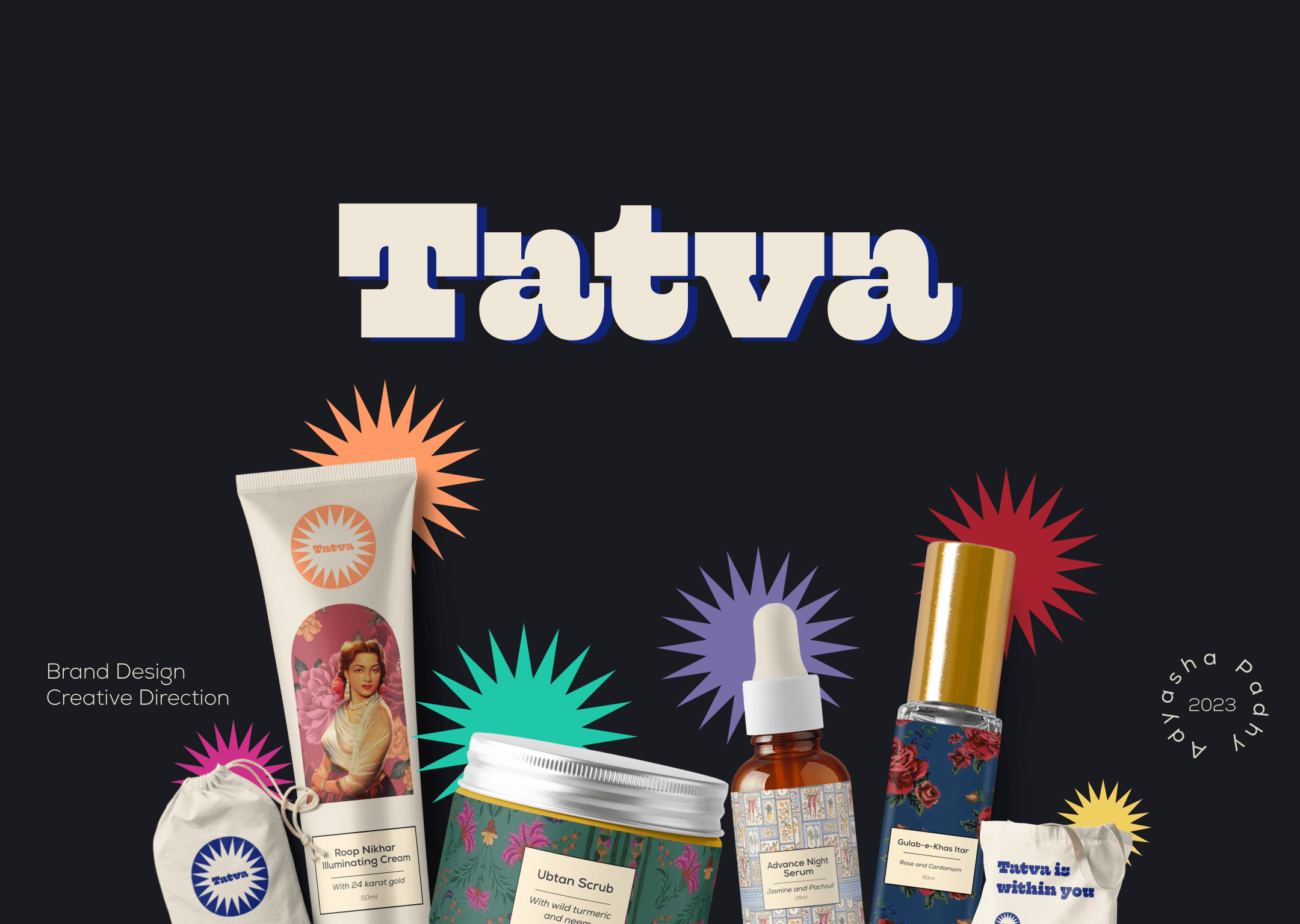
A concept brand identity design for a beauty company from India to the world
A concept brand identity design for a beauty company from India to the world
A concept brand identity design for a beauty company from India to the world
A concept brand identity design for a beauty company from India to the world
00
00

00

00

Problem
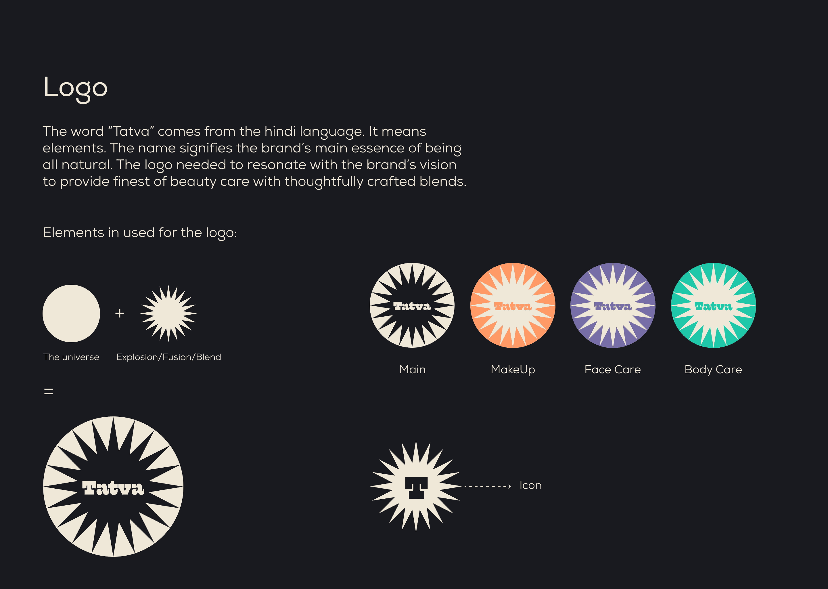
The brief was to make an ayurvedic brand cool and relevant for the modern indian women on the go. The brand wanted to bring in the playfulness but at the same time play strong on the nostalgia aspects. Tatva believed in products that had ayurvedic benifits and at the same time have science infused in the composition. The branding had to incline into both the concepts.
Solution
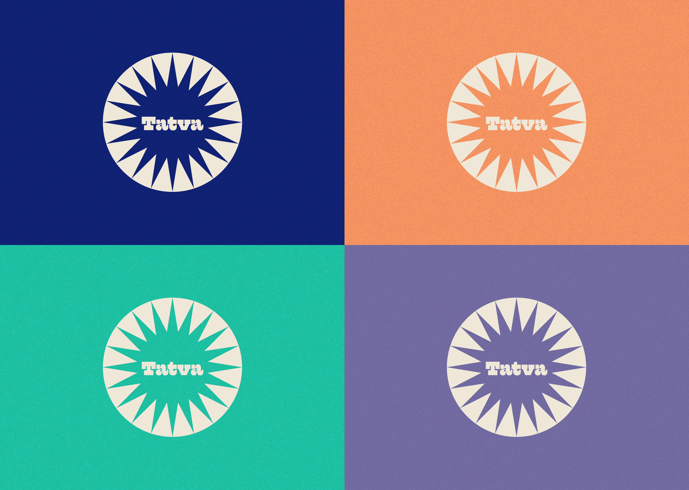
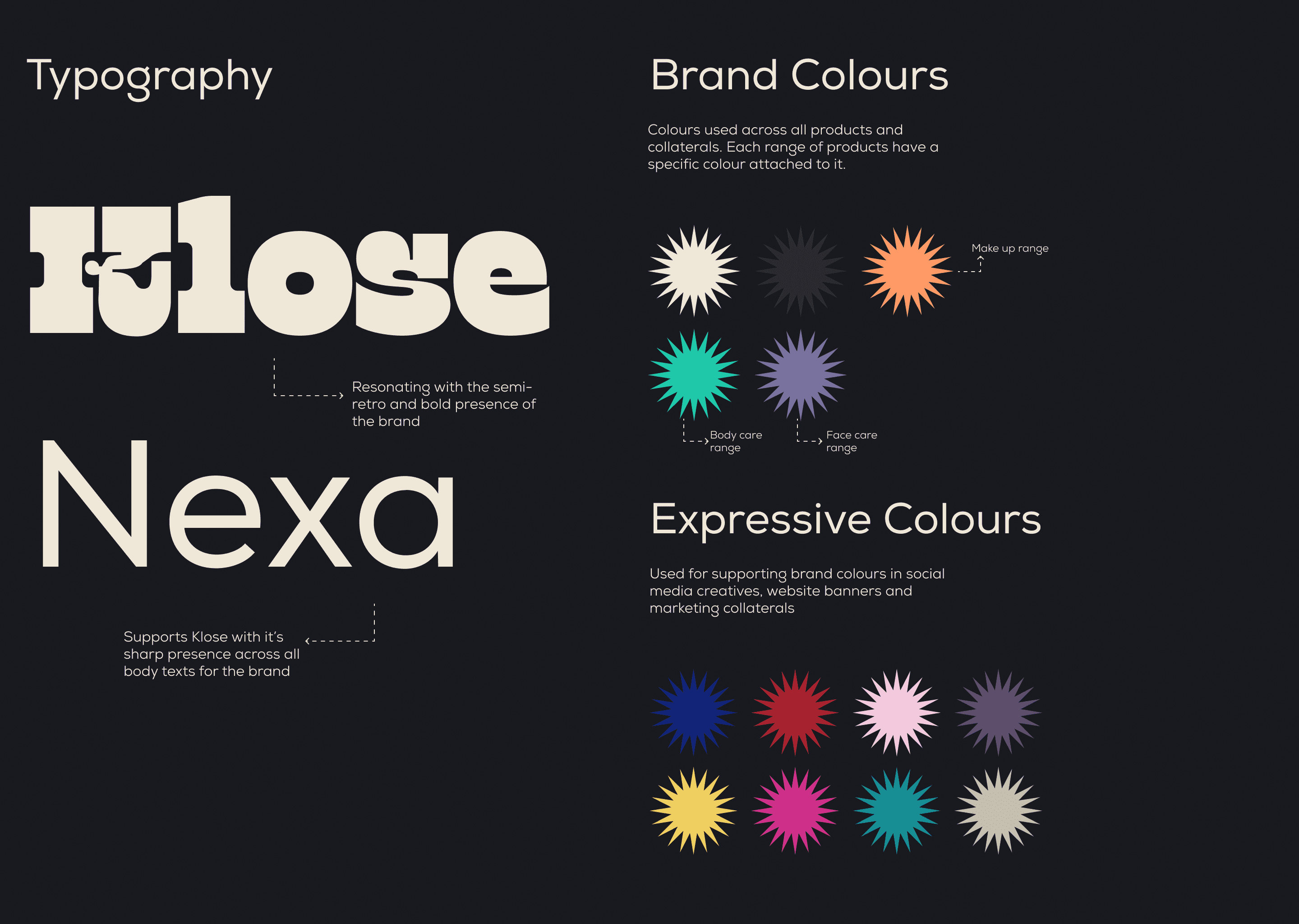
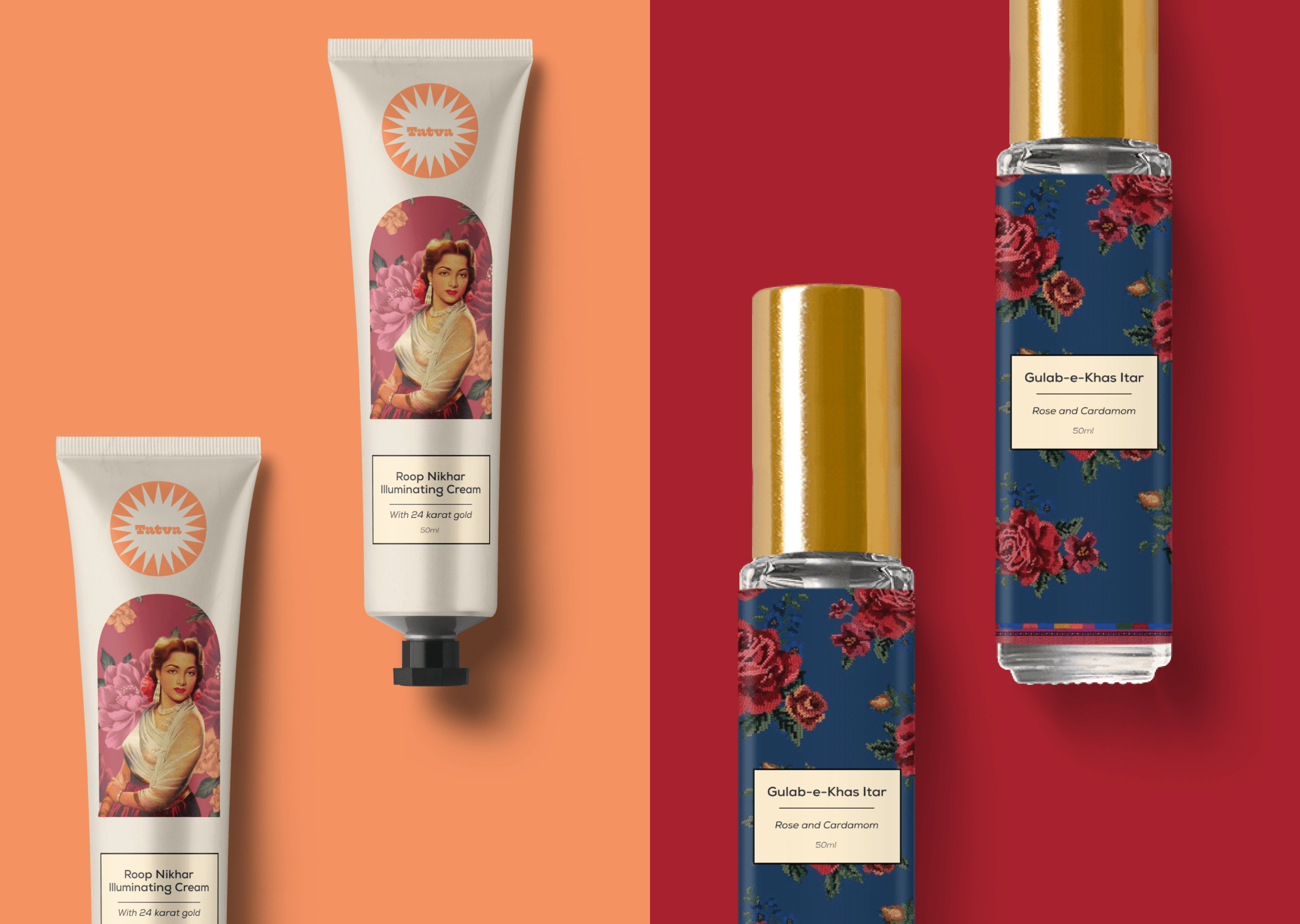
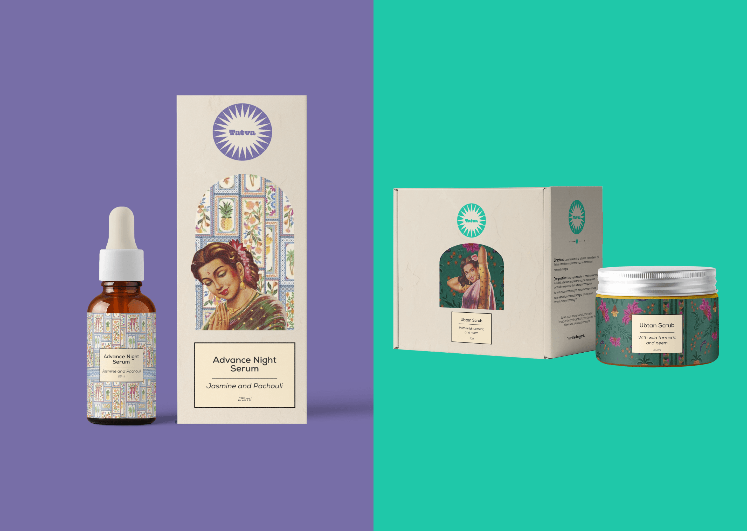
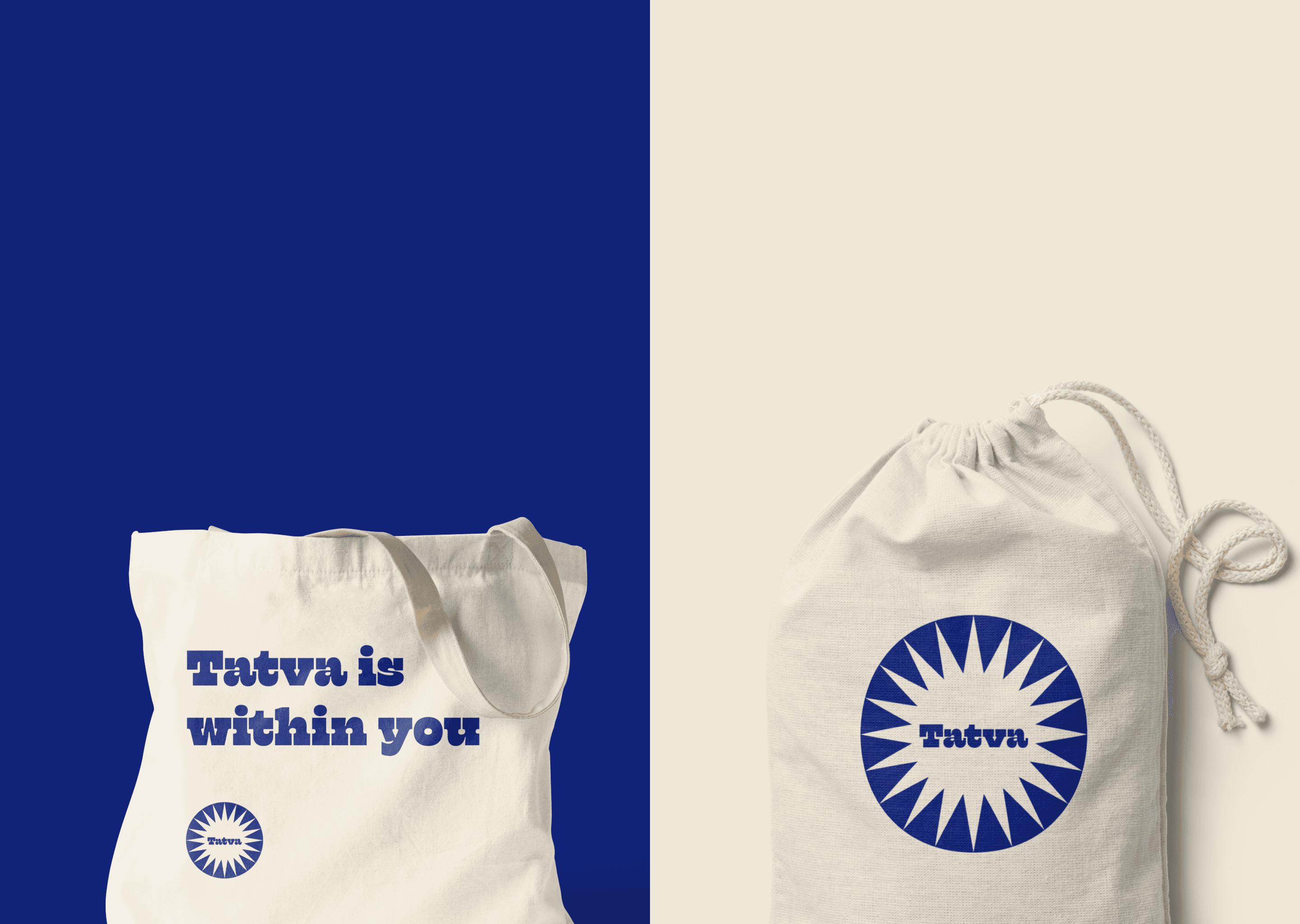
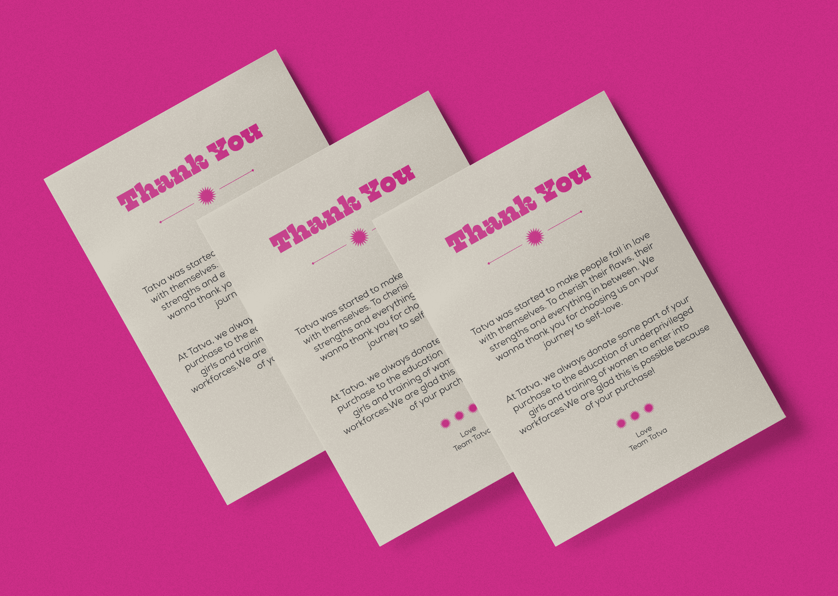
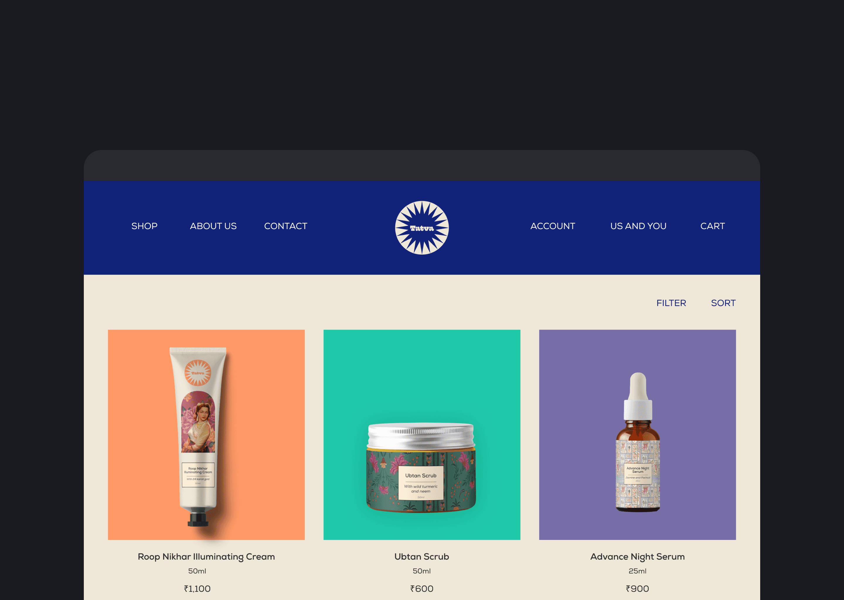
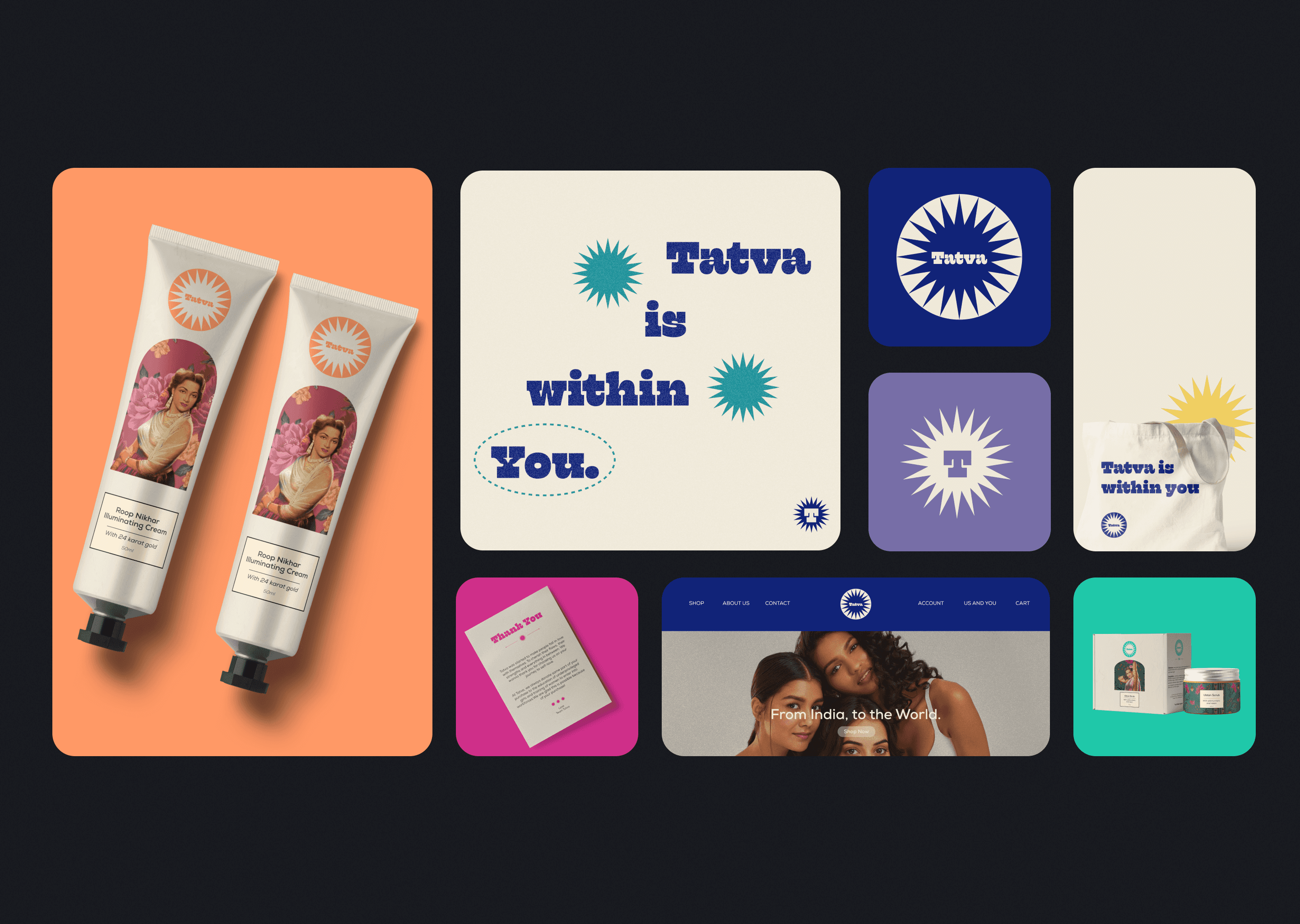
I was very inspired by old Indian advertsements where they used to use very vibrant colours, poster paint like textures and a different form of showing women's beauty. I replicated the same into the brand's core identity to bring in the nostalgia factor. I went onto use a muted yet vibrant colour pallete heavily inspired by the "Matti" (mud in english) to reflect on the notion of connecting to roots. The packaging was made like old indian posters which people are used to see or hear about from their elderly.
The exploration started by going back in time, when acrylic posters were a thing and the world was all about print media. The exploration phase also included highlighting the patterns that are very much visible in day to day lives of Indian people. The aim was to go behind in time and search for things that can be brought to use for a beauty brand operating in today’s day and time.
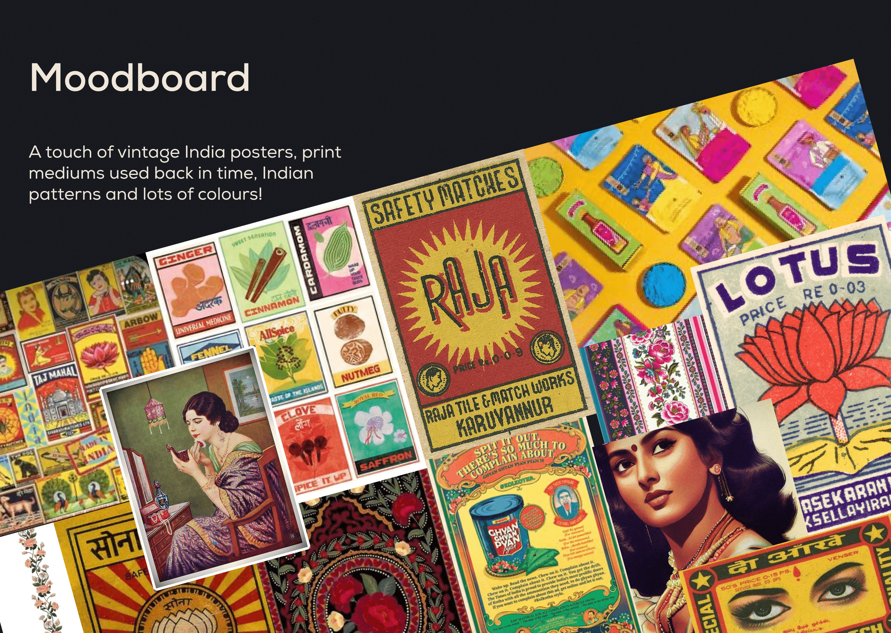
* Disclaimer: The picture sourced for the mood board and for the core packaging are only used at the capacity of a creative personal project. This is not owned by the brand or the designer does not have any intention to publish this to live world.
year
2023
timeframe
1 month
tools
Figma and Illustrator
category
Personal Project
The exploration started by going back in time, when acrylic posters were a thing and the world was all about print media. The exploration phase also included highlighting the patterns that are very much visible in day to day lives of Indian people. The aim was to go behind in time and search for things that can be brought to use for a beauty brand operating in today’s day and time.

* Disclaimer: The picture sourced for the mood board and for the core packaging are only used at the capacity of a creative personal project. This is not owned by the brand or the designer does not have any intention to publish this to live world.
year
2023
timeframe
1 month
tools
Figma and Illustrator
category
Personal Project
The exploration started by going back in time, when acrylic posters were a thing and the world was all about print media. The exploration phase also included highlighting the patterns that are very much visible in day to day lives of Indian people. The aim was to go behind in time and search for things that can be brought to use for a beauty brand operating in today’s day and time.

* Disclaimer: The picture sourced for the mood board and for the core packaging are only used at the capacity of a creative personal project. This is not owned by the brand or the designer does not have any intention to publish this to live world.
year
2023
timeframe
1 month
tools
Figma and Illustrator
category
Personal Project
The exploration started by going back in time, when acrylic posters were a thing and the world was all about print media. The exploration phase also included highlighting the patterns that are very much visible in day to day lives of Indian people. The aim was to go behind in time and search for things that can be brought to use for a beauty brand operating in today’s day and time.

* Disclaimer: The picture sourced for the mood board and for the core packaging are only used at the capacity of a creative personal project. This is not owned by the brand or the designer does not have any intention to publish this to live world.
year
2023
timeframe
1 month
tools
Figma and Illustrator
category
Personal Project


01
02

02

02

02
03

03

03

03
04

04

04

04
05

05

05

05
06

06

06

06
07

07

07

07
08

08

08

08
09

09

09

09
.say hello
I'm open for freelance projects.
Feel free to email me to see how can we collaborate!
.say hello
I'm open for freelance projects.
Feel free to email me to see how can we collaborate!
.say hello
I'm open for freelance projects.
Feel free to email me to see how can we collaborate!
say hello


